library("iddconf2026")
library("dplyr")
library("tidyr")
library("ggplot2")
library("scoringutils")Forecasting models
Introduction
We can classify models along a spectrum by how much they include an understanding of underlying processes, or mechanisms; or whether they emphasise drawing from the data using a statistical approach. In this session, we’ll start with the renewal model that we’ve been using and explore adding both more mechanistic structure and then more statistical structure to the model. We then evaluate three models from across this spectrum using pre-generated forecasts.
Slides
Objectives
The aim of this session is to introduce some common forecasting models and to evaluate them.
Caution
None of the models introduced in this section are designed for real-world use!
NoteSetup
Source file
The source file of this session is located at sessions/forecasting-models.qmd.
Libraries used
In this session we will use the iddconf2026 package to load a data set of infection times and pre-generated forecasts and to access helper functions, the dplyr and tidyr packages for data wrangling, the ggplot2 library for plotting and the scoringutils package for evaluating forecasts.
Tip
The best way to interact with the material is via the Visual Editor of RStudio.
Initialisation
We set a random seed for reproducibility. Setting this ensures that you should get exactly the same results on your computer as we do.
set.seed(123)What did we learn about the random walk model from the forecast evaluation session?
- It was unbiased when the reproduction number was approximately constant but when the reproduction number was reducing due to susceptible depletion, the random walk model overestimated the number of cases systematically.
- It did relatively well at short-term forecasting indicating that it was capturing some of the underlying dynamics of the data generating process.
NoteWhat did a geometric random walk model look like again?
R <- geometric_random_walk(init = 1, noise = rnorm(100), std = 0.1)
data <- tibble(t = seq_along(R), R = R)

ggplot(data, aes(x = t, y = R)) +
  geom_line() +
  labs(title = "Simulated data from a random walk model",
       x = "Time",
       y = "R")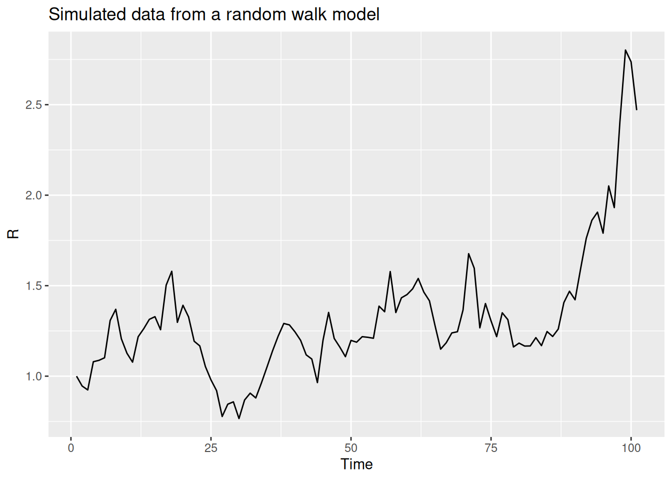
Forecasting models as a spectrum
The forecasts we have used so far come from a renewal model, which builds in mechanistic structure about how infections generate future onsets and how transmission changes over time. Modelling the underlying mechanisms of the data generating process like this can be powerful. However, in many forecasting scenarios, we may not have a good understanding of the underlying mechanisms, or the data may be too noisy to make accurate predictions. The worst case is that we have mistaken beliefs about the underlying mechanisms and use these to make predictions which are systematically wrong and misleading. In these cases, forecasters often use statistical models to make predictions which have little or no mechanistic basis. In our work, we have found that a combination of mechanistic and statistical models can be very powerful but that identifying the best model for a given forecasting task can be challenging.
Adding more mechanistic structure to the renewal model
One way to potentially improve the renewal model is to add more mechanistic structure. In the forecast evaluation session, we saw that the renewal model was making unbiased forecasts when the reproduction number was constant but that it overestimated the number of cases when the reproduction number was reducing due to susceptible depletion.
Warning
This is slightly cheating as we know the future of this outbreak and so can make a model to match. This is easy to do and important to watch for if wanting to make generalisable methods.
This suggests that we should add a term to the renewal model which captures the depletion of susceptibles. One way to do this is to add a term which is proportional to the number of susceptibles in the population. This is the idea behind the SIR model which is a simple compartmental model of infectious disease transmission. If we assume that susceptible depletion is the only mechanism which is causing the reproduction number to change, we can write the reproduction model as:
\[ R_t = \frac{S_{t-1}}{N} R_0 \]
Note
This approximates susceptible depletion as a linear function of the number of susceptibles in the population. This is a simplification but it is a good starting point.
NoteWhat behaviour would we expect from this model?
n <- 100
N <- 1000
R0 <- 1.5
S <- rep(NA, n)
S[1] <- N
Rt <- rep(NA, n) ## reproduction number
Rt[1] <- R0
I <- rep(NA, n)
I[1] <- 1
for (i in 2:n) {
  Rt[i] <- (S[i-1]) / N * R0
  I[i] <- I[i-1] * Rt[i]
  S[i] <- S[i-1] - I[i]
}

data <- tibble(t = 1:n, Rt = Rt)

ggplot(data, aes(x = t, y = Rt)) +
  geom_line() +
  labs(title = "Simulated data from an SIR model",
       x = "Time",
       y = "Rt")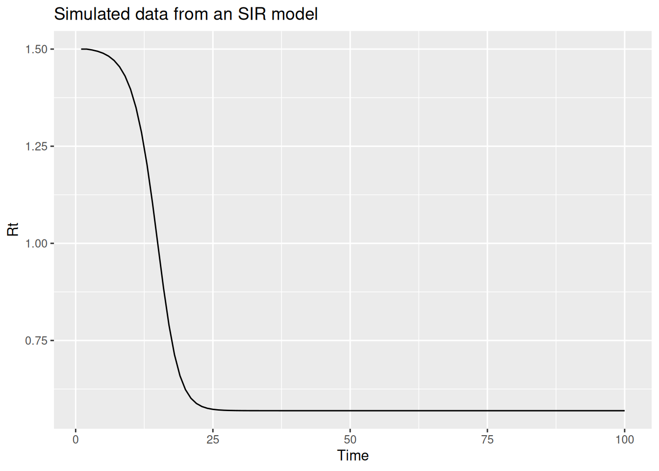
The key assumptions we are making here are:
- The population is constant and we roughly know the size of the population.
- The reproduction number only changes due to susceptible depletion
- The number of new cases at each time is proportional to the number of susceptibles in the population.
As the susceptible pool shrinks, this pulls the reproduction number down over time, so the model captures the downturn in cases that the plain renewal model overestimated. We implemented this susceptible-depletion renewal model and fitted it to our simulated outbreak offline. We compare its forecasts with the other models later in this session.
Adding more statistical structure to the renewal model
Adding more mechanistic structure is not always possible and, if we don’t specify mechanisms correctly, might make forecasts worse. Rather than adding more mechanistic structure to the renewal model, we could add more statistical structure with the aim of improving performance. Before we do this, we need to think about what we want from a forecasting model. As we identified above, we want a model which is unbiased and which has good short-term forecasting properties. We know that we want it to be able to adapt to trends in the reproduction number and that we want it to be able to capture the noise in the data. A statistical term that can be used to describe a time series with a trend is saying that the time series is non-stationary. More specifically, a stationary time series is defined as one whose statistical properties, such as mean and variance, do not change over time. In infectious disease epidemiology, this would only be expected for endemic diseases without external seasonal influence.
The random walk model we used in the forecasting concepts session is a special case of a more general class of models called autoregressive (AR) models. AR models are a class of models which predict the next value in a time series as a linear combination of the previous values in the time series. The random walk model is specifically a special case of an AR(1) model where the next value in the time series is predicted as the previous value, multiplied by a value between 1 and -1 , plus some noise. This becomes a random walk when the multipled value is 0.
For the log-transformed reproduction number (\(log(R_t)\)), the model is:
\[ log(R_t) = \phi log(R_{t-1}) + \epsilon_t \]
where \(\epsilon_t\) is a normally distributed error term with mean 0 and standard deviation \(\sigma\) and \(\phi\) is a parameter between -1 and 1. If we restrict \(\phi\) to be between 0 and 1, we get a model which is biased towards a reproduction number of 1 but which can still capture trends in the data that decay over time.
NoteWhat behaviour would we expect from this model?
n <- 100
phi <- 0.4
sigma <- 0.1
log_R <- rep(NA, n)
log_R[1] <- rnorm(1, 0, sigma)
for (i in 2:n) {
  log_R[i] <- phi * log_R[i-1] + rnorm(1, 0, sigma)
}
data <- tibble(t = 1:n, R = exp(log_R))

ggplot(data, aes(x = t, y = R)) +
  geom_line() +
  labs(title = "Simulated data from an exponentiated AR(1) model",
       x = "Time",
       y = "R")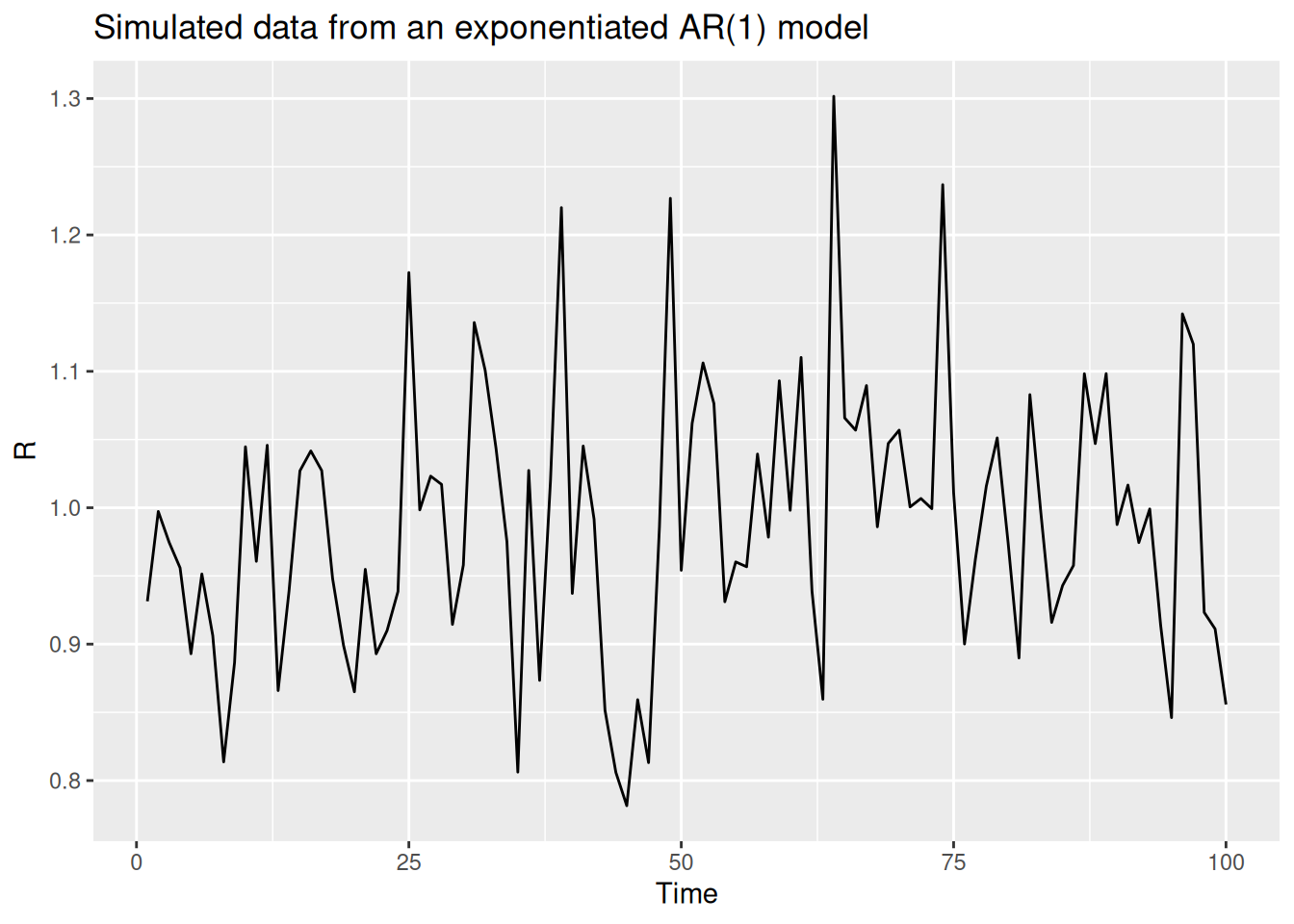
However, we probably don’t want a model which is biased towards a reproduction number of 1 (unless we have good reason to believe that is the expected behaviour). Because we expect a trend in the reproduction number, we can instead model the change in the log reproduction number from one step to the next, a time series technique called differencing. This gives a model with momentum, where recent trends in the reproduction number carry forward into the forecast rather than decaying back towards 1.
NoteWhat behaviour would we expect from this model?
Differencing makes a non-stationary time series stationary by modelling the difference between consecutive values. For the log-transformed reproduction number, this is:
\[ log(R_t) - log(R_{t-1}) = \phi (log(R_{t-1}) - log(R_{t-2})) + \epsilon_t \]
We look at an R function that implements this model:
geometric_diff_arfunction (init, noise, std, damp)
{
n <- length(noise) + 1
x <- numeric(n)
x[1] <- log(init)
x[2] <- x[1] + noise[1] * std
for (i in 3:n) {
x[i] <- x[i - 1] + damp * (x[i - 1] - x[i - 2]) + noise[i -
1] * std
}
exp(x)
}
<bytecode: 0x55b71c820ee0>
<environment: namespace:iddconf2026>We can use this function to simulate a differenced AR process:
R <- geometric_diff_ar(init = 1, noise = rnorm(100), std = 0.1, damp = 0.1)

data <- tibble(t = seq_along(R), R = R)

ggplot(data, aes(x = t, y = R)) +
  geom_line() +
  labs(title = "Simulated data from an exponentiated AR(1) model with differencing",
       x = "Time",
       y = "R")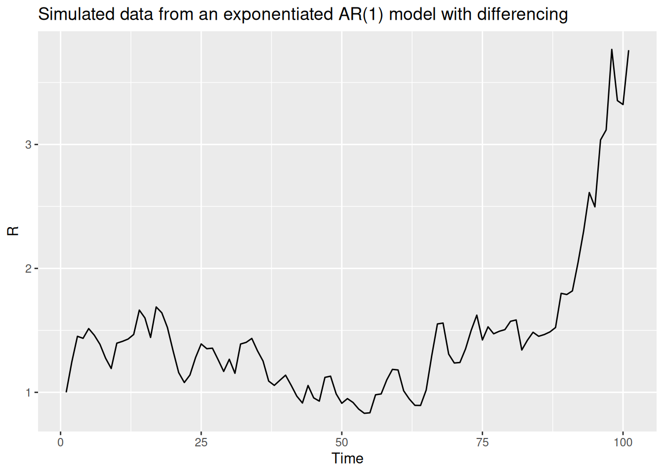
We implemented this differenced AR renewal model and, as with the mechanistic model, fitted it to our simulated outbreak offline. We compare its forecasts with the other models below.
Evaluating forecasts from our models
We fitted the random walk, more mechanistic and more statistical models to a range of forecast dates offline so you don’t have to wait for the models to fit. Each model shares the same renewal-with-delays structure and differs only in how the reproduction number evolves over time. We now load these pre-generated forecasts and evaluate them.
First we load the saved dataset of observed onsets provided in the package so we have the observed data to compare against.
data(onset_df)
onset_df
# A tibble: 142 × 3
day onsets infections
<dbl> <int> <int>
1 1 0 0
2 2 0 1
3 3 0 0
4 4 0 2
5 5 0 1
6 6 1 1
7 7 1 1
8 8 0 3
9 9 1 0
10 10 1 0
# ℹ 132 more rowsdata(rw_forecasts, stat_forecasts, mech_forecasts)
forecasts <- bind_rows(
rw_forecasts,
mutate(stat_forecasts, model = "More statistical"),
mutate(mech_forecasts, model = "More mechanistic")
)
TipHow did we estimate these forecasts?
We generated these forecasts using the code in data-raw/generate-example-forecasts.r which fits each of the three models to many forecast dates.
Some important things to note about these forecasts:
- We used a 14 day forecast horizon.
- Each forecast used all the data up to the forecast date.
- We generated 1000 posterior samples for each forecast.
- We started forecasting 3 weeks into the outbreak and then forecast every 7 days until the end of the data (excluding the last 14 days to allow a full forecast).
- We use the same simulated outbreak data:
head(onset_df)# A tibble: 6 × 3
day onsets infections
<dbl> <int> <int>
1 1 0 0
2 2 0 1
3 3 0 0
4 4 0 2
5 5 0 1
6 6 1 1Visualising your forecast
forecasts |>
  filter(.draw %in% sample(.draw, 100)) |>
  ggplot(aes(x = day)) +
  geom_line(aes(y = .value, group = interaction(.draw, origin_day), col = origin_day), alpha = 0.1) +
  geom_point(data = onset_df |>
    filter(day >= 21),
    aes(x = day, y = onsets), color = "black") +
  scale_color_binned(type = "viridis") +
  facet_wrap(~model) +
  lims(y = c(0, 500))
Warning: Removed 65 rows containing missing values or values outside the scale range
(`geom_line()`).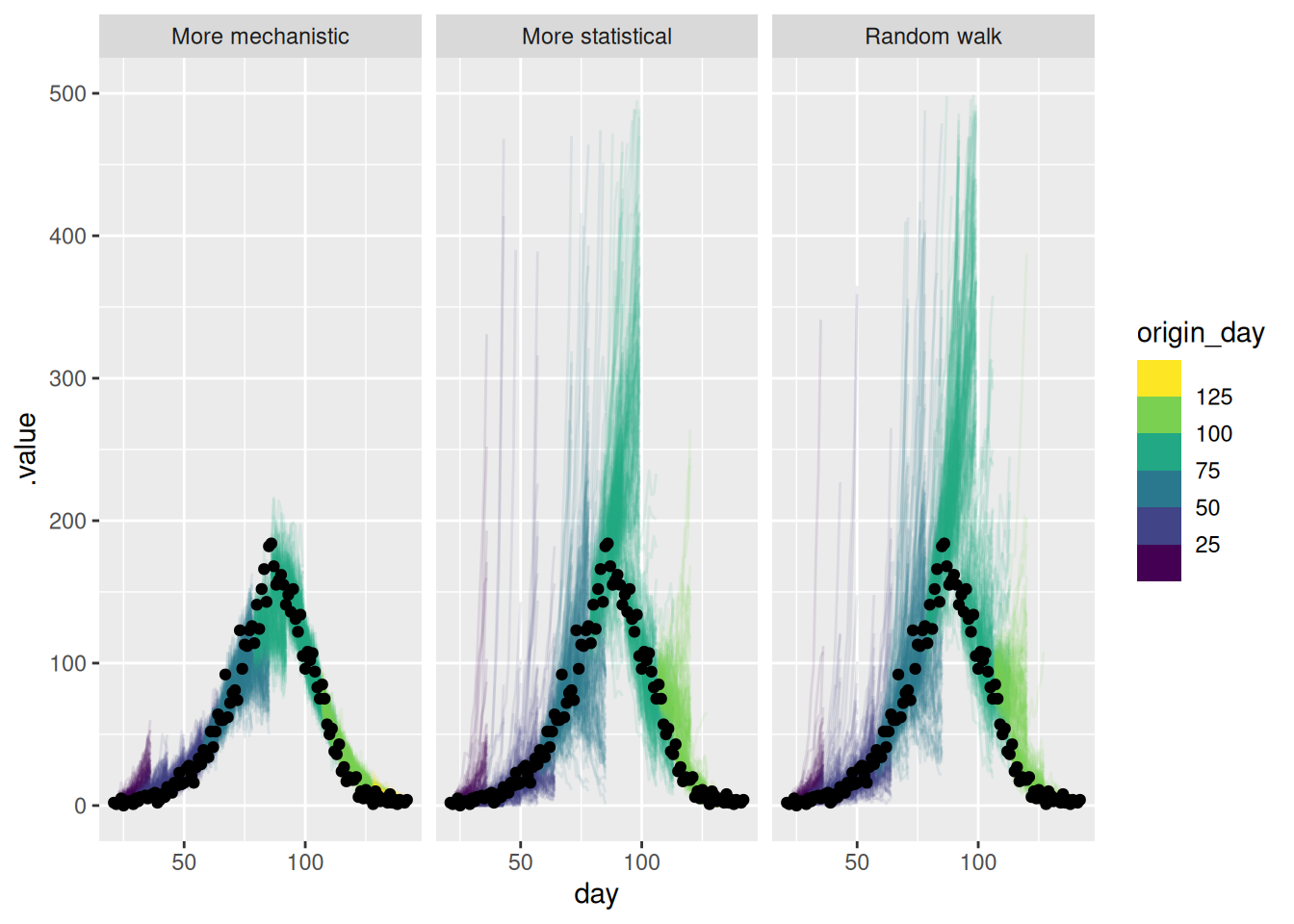
As for the single forecast it is helpful to also plot the forecast on the log scale.
forecasts |>
  filter(.draw %in% sample(.draw, 100)) |>
  ggplot(aes(x = day)) +
  geom_line(
    aes(y = .value, group = interaction(.draw, origin_day), col = origin_day),
    alpha = 0.1
  ) +
  geom_point(data = onset_df, aes(x = day, y = onsets), color = "black") +
  scale_y_log10(limits = c(NA, 500)) +
  scale_color_binned(type = "viridis") +
  facet_wrap(~model)
Warning in scale_y_log10(limits = c(NA, 500)): log-10 transformation introduced infinite values.
log-10 transformation introduced infinite values.Warning: Removed 99 rows containing missing values or values outside the scale range
(`geom_line()`).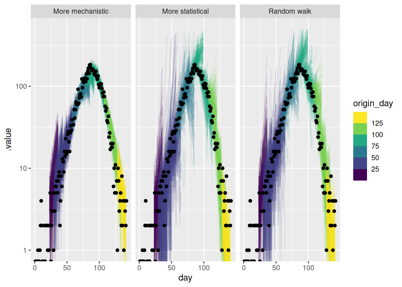
TipTake 5 minutes
How do these forecasts compare? Which do you prefer?
NoteSolution
How do these forecasts compare?
- The more mechanistic model captures the downturn in the data very well.
- Past the peak all models were comparable.
- The more statistical model captures the downturn faster than the random walk but less fast than the more mechanistic mode.
- The more statistical model sporadically predicts a more rapidly growing outbreak than occurred early on.
- The more statistical model is more uncertain than the mechanistic model but less uncertain than the random walk.
Which do you prefer?
- The more mechanistic model seems to be the best at capturing the downturn in the data and the uncertainty in the forecasts seems reasonable.
- If we weren’t confident in the effective susceptible population the AR model might be preferable.
Scoring your forecast
sc_forecasts <- forecasts |>
  left_join(onset_df, by = "day") |>
  filter(!is.na(.value)) |>
  as_forecast_sample(
    forecast_unit = c(
      "origin_day", "horizon", "model"
    ),
    observed = "onsets",
    predicted = ".value",
    sample_id = ".draw"
  )
sc_forecasts
Forecast type: sampleForecast unit:origin_day, horizon, and model
        sample_id predicted observed origin_day horizon            model
            <int>     <num>    <int>      <num>   <int>           <char>
     1:         1         9        2         22       1      Random walk
     2:         2         5        2         22       1      Random walk
     3:         3         5        2         22       1      Random walk
     4:         4         3        2         22       1      Random walk
     5:         5         5        2         22       1      Random walk
    ---
671996:       996         4        3        127      14 More mechanistic
671997:       997         2        3        127      14 More mechanistic
671998:       998         1        3        127      14 More mechanistic
671999:       999         2        3        127      14 More mechanistic
672000:      1000         1        3        127      14 More mechanistic
Everything seems to be in order. We can now use the scoringutils package to calculate some metrics as we did in the forecasting evaluation session.
sc_scores <- sc_forecasts |>
  score()
Warning: Predictions appear to be integer-valued.
! The log score uses kernel density estimation, which may not be appropriate
for integer-valued forecasts.
ℹ See the scoringRules package for alternatives for discrete probability
distributions.sc_scores origin_day horizon model bias dss crps
<num> <int> <char> <num> <num> <num>
1: 22 1 Random walk 0.477 2.079376 0.800163
2: 22 2 Random walk 0.611 2.577868 1.154219
3: 22 3 Random walk 0.066 2.257788 0.656429
4: 22 4 Random walk 0.482 2.884754 1.203126
5: 22 5 Random walk 0.631 3.404152 1.686931
---
668: 127 10 More mechanistic 0.937 4.395878 2.404723
669: 127 11 More mechanistic -0.082 1.458382 0.469985
670: 127 12 More mechanistic -0.959 6.984772 3.432483
671: 127 13 More mechanistic 0.958 4.645170 2.347316
672: 127 14 More mechanistic -0.048 1.147720 0.394765
overprediction underprediction dispersion log_score mad ae_median
<num> <num> <num> <num> <num> <num>
1: 0.302 0.000 0.498163 1.767425 1.4826 1
2: 0.584 0.000 0.570219 1.990551 2.9652 2
3: 0.000 0.000 0.656429 1.960774 2.9652 0
4: 0.460 0.000 0.743126 2.152722 2.9652 2
5: 0.888 0.000 0.798931 2.337022 2.9652 3
---
668: 1.930 0.000 0.474723 2.945781 1.4826 3
669: 0.000 0.000 0.469985 1.557575 1.4826 0
670: 0.000 2.982 0.450483 4.080604 1.4826 5
671: 1.924 0.000 0.423316 3.065969 1.4826 3
672: 0.000 0.000 0.394765 1.423667 1.4826 0
se_mean
<num>
1: 2.461761
2: 4.721929
3: 0.546121
4: 5.466244
5: 10.686361
---
668: 12.552849
669: 0.000361
670: 19.527561
671: 11.209104
672: 0.001521
NoteLearning more about the output of
score()
See the documentation for ?get_metrics.forecast_sample for information on the default sample metrics.
At a glance
Let’s summarise the scores by model first.
sc_scores |>
  summarise_scores(by = "model")
model bias dss crps overprediction
<char> <num> <num> <num> <num>
1: Random walk 0.21065179 6.295836 13.324931 7.828018
2: More statistical 0.01454464 6.642911 12.536005 6.089705
3: More mechanistic 0.23080804 5.748815 6.984833 2.086893
underprediction dispersion log_score mad ae_median se_mean
<num> <num> <num> <num> <num> <num>
1: 0.8525804 4.644333 3.927755 19.296966 18.044643 1606.8229
2: 2.1009643 4.345335 4.166965 17.715084 17.303571 1270.1199
3: 2.9030268 1.994914 3.764602 8.518331 9.620536 212.8449
TipTake 2 minutes
Before we look in detail at the scores, what do you think the scores are telling you? Which model do you think is best?
Continuous ranked probability score
As in the forecast evaluation session, we will start by looking at the CRPS by horizon and forecast date.
TipReminder: Key things to note about the CRPS
- Small values are better
- When scoring absolute values (e.g. number of cases) it can be difficult to compare forecasts across scales (i.e., when case numbers are different, for example between locations or at different times).
First by forecast horizon.
sc_scores |>
  summarise_scores(by = c("model", "horizon")) |>
  ggplot(aes(x = horizon, y = crps, col = model)) +
  geom_point()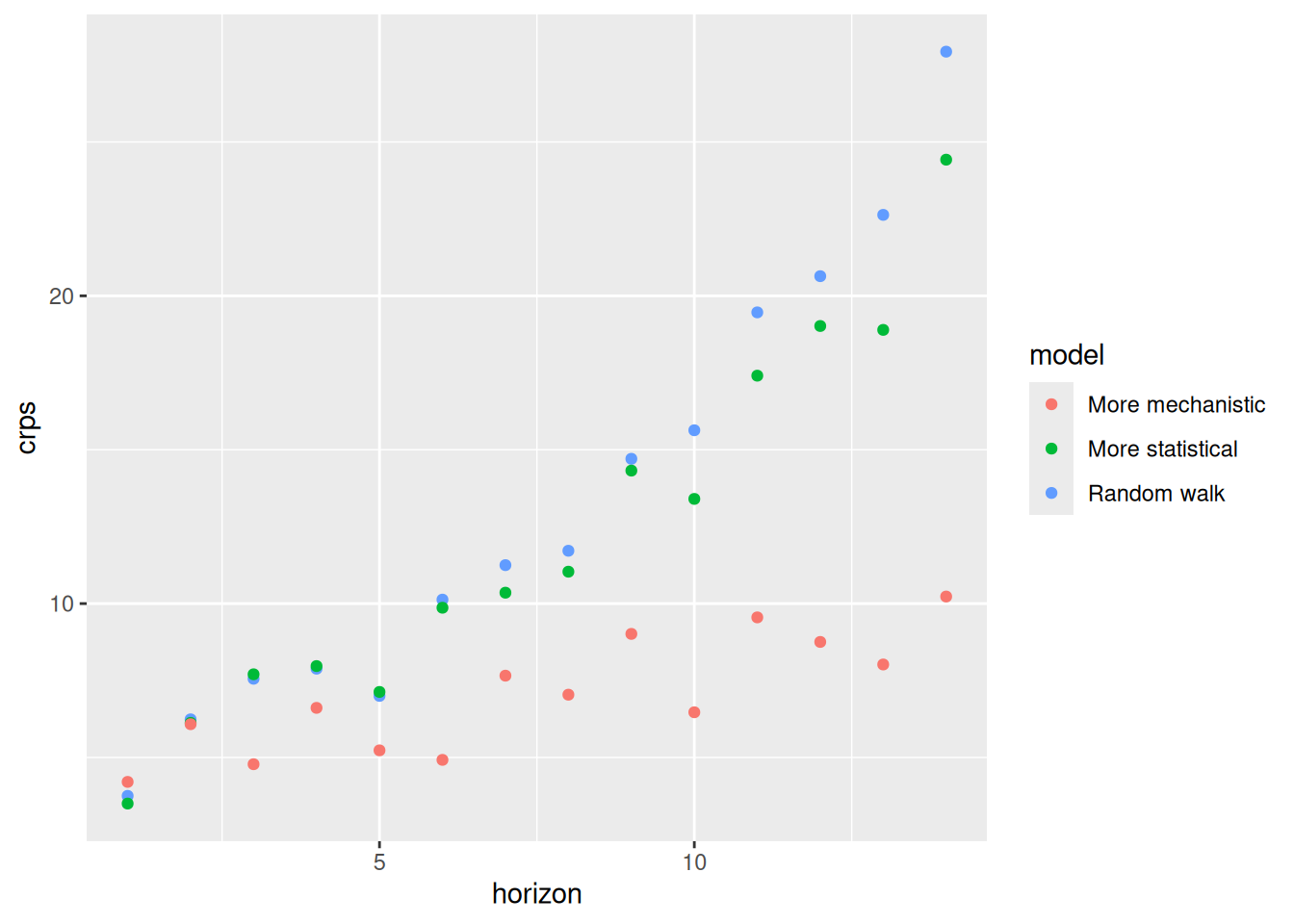
and across different forecast dates
sc_scores |>
  summarise_scores(by = c("origin_day", "model")) |>
  ggplot(aes(x = origin_day, y = crps, col = model)) +
  geom_point()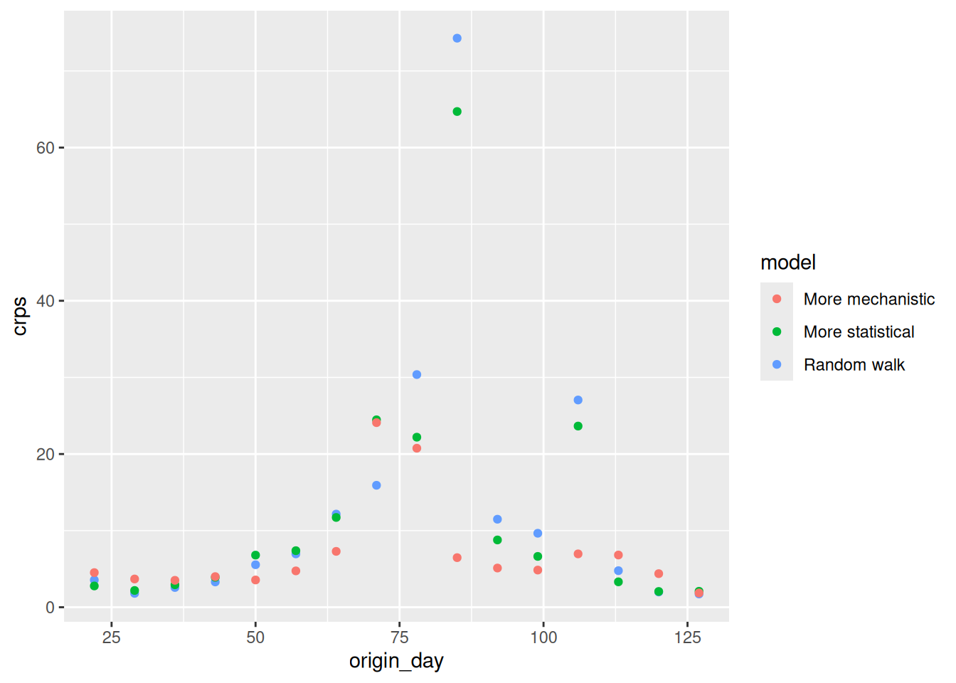
TipTake 5 minutes
How do the CRPS values change based on forecast date? How do the CRPS values change with forecast horizon?
NoteSolution
How do the CRPS values change based on forecast horizon?
- All models have increasing CRPS with forecast horizon.
- The more mechanistic model has the lowest CRPS at all forecast horizon.
- The more stastical model starts to outperform the random walk model at longer time horizons.
How do the CRPS values change with forecast date?
- The more statistical model does particularly poorly around the peak of the outbreak but outperforms the random walk model.
- The more mechanistic model does particularly well around the peak of the outbreak versus all other models
- The more statistical model starts to outperform the other models towards the end of the outbreak.
PIT histograms
TipReminder: Interpreting the PIT histogram
- Ideally PIT histograms should be uniform.
- If is a U shape then the model is overconfident and if it is an inverted U shape then the model is underconfident.
- If it is skewed then the model is biased towards the direction of the skew.
Let’s first look at the overall PIT histogram.
sc_forecasts |>
  get_pit_histogram(by = "model") |>
  ggplot(aes(x = mid, y = density)) +
  geom_col() +
  facet_wrap(~model) +
  labs(x = "Predicted quantiles")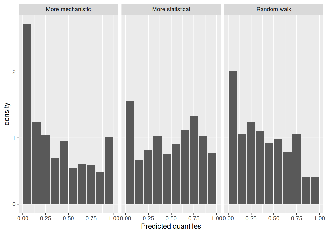
As before let’s look at the PIT histogram by forecast horizon (to save space we will group horizons)
sc_forecasts |>
  mutate(group_horizon = case_when(
    horizon <= 3 ~ "1-3",
    horizon <= 7 ~ "4-7",
    horizon <= 14 ~ "8-14"
  )) |>
  get_pit_histogram(by = c("model", "group_horizon")) |>
  ggplot(aes(x = mid, y = density)) +
  geom_col() +
  facet_grid(vars(model), vars(group_horizon)) +
  labs(x = "Predicted quantiles")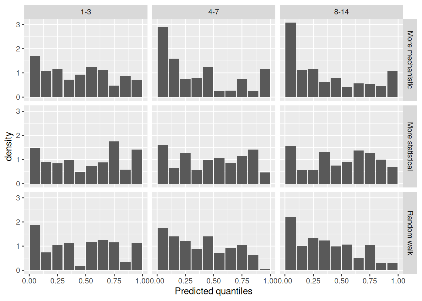
and then for different forecast dates.
sc_forecasts |>
  get_pit_histogram(by = c("model", "origin_day")) |>
  ggplot(aes(x = mid, y = density)) +
  geom_col() +
  facet_grid(vars(model), vars(origin_day)) +
  labs(x = "Predicted quantiles")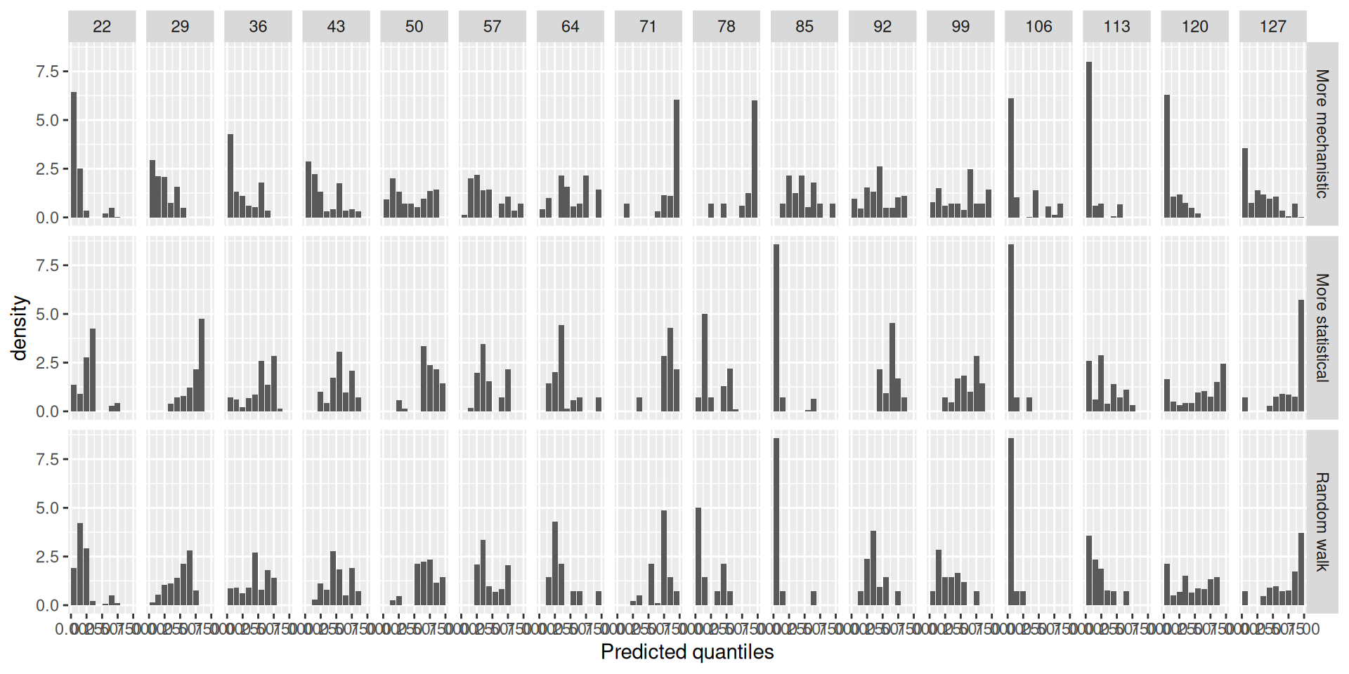
TipTake 2 minutes
What do you think of the PIT histograms?
NoteSolution
What do you think of the PIT histograms?
- The more mechanistic model is reasonably well calibrated but has a slight tendency to be overconfident.
- The random walk is biased towards overpredicting.
- The more statistical model is underconfident.
- Across horizons the more mechanistic model is only liable to underpredict at the longest horizons.
- The random walk model is initially relatively unbiased and well calibrated but becomes increasingly likely to overpredict as the horizon increases.
- The forecast date stratified PIT histograms are hard to interpret. We may need to find other ways to visualise bias and calibration at this level of stratification (see the
{scoringutils}documentation for some ideas).
Scoring on the log scale
Again as in the forecast evaluation session, we will also score the forecasts on the log scale.
log_sc_forecasts <- sc_forecasts |>
  transform_forecasts(
    fun = log_shift,
    offset = 1,
    append = FALSE
  )

log_sc_scores <- log_sc_forecasts |>
  score()
Tip
Reminder: For more on scoring on the log scale see Bosse et al. (2023) on scoring forecasts on transformed scales.
At a glance
log_sc_scores |>
  summarise_scores(by = "model")
model bias dss crps overprediction
<char> <num> <num> <num> <num>
1: Random walk 0.21065179 -0.6932839 0.2385248 0.11726146
2: More statistical 0.01454464 -0.5965958 0.2507538 0.07905115
3: More mechanistic 0.23080804 -0.9250449 0.2242066 0.14704988
underprediction dispersion log_score mad ae_median se_mean
<num> <num> <num> <num> <num> <num>
1: 0.02994692 0.09131641 0.5302044 0.3940836 0.3242059 0.1965840
2: 0.06768002 0.10402266 0.5646595 0.4324431 0.3470374 0.2178278
3: 0.02574405 0.05141266 0.3331268 0.2202521 0.3077472 0.1889029
TipTake 2 minutes
Before we look in detail at the scores, what do you think the scores are telling you? Which model do you think is best?
CRPS
log_sc_scores |>
  summarise_scores(by = c("model", "horizon")) |>
  ggplot(aes(x = horizon, y = crps, col = model)) +
  geom_point()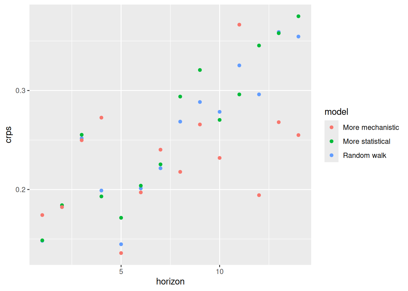
log_sc_scores |>
  summarise_scores(by = c("origin_day", "model")) |>
  ggplot(aes(x = origin_day, y = crps, col = model)) +
  geom_point()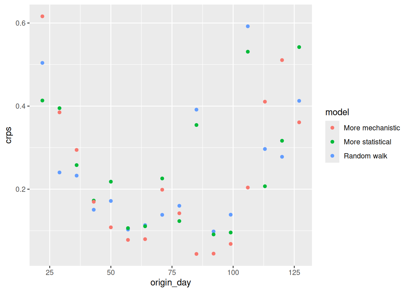
TipTake 5 minutes
How do the CRPS values on the log scale compare to the scores on the original scale?
NoteSolution
- The performance of the mechanistic model is more variable across forecast horizon than on the natural scale.
- On the log scale the by horizon performance of the random walk and more statistical mdoel is more comparable than on the log scale.
- The period of high incidence dominates the origin day stratified scores less on the log scale. We see that all models performed less well early and late on.
Going further
Challenge
- We have only looked at three forecasting models here. There are many more models that could be used. For example, we could use a more complex mechanistic model which captures more of the underlying dynamics of the data generating process. We could also use a more complex statistical model which captures more of the underlying structure of the data.
- We could also combine the more mechanistic and more statistical models to create a hybrid model which captures the best of both worlds (maybe).
- We could also use a more complex scoring rule to evaluate the forecasts. For example, we could use a multivariate scoring rule which captures more of the structure of the data.
- Consider how forecasting approaches might differ in non-outbreak settings: What additional factors might you need to account for when applying these methods to routine surveillance data? Think about seasonal patterns, long-term trends, holiday effects, or other cyclical behaviours that might influence transmission dynamics and reporting patterns.
Methods in practice
- The statistical models we’ve discussed here represent just a subset of available forecasting approaches. For a treatment of time series forecasting models, including ARIMA models as a generalisation of autoregressive approaches with additional features for differencing and moving averages, see Hyndman and Athanasopoulos (2021). These models offer a different workflow for thinking about forecasting. Whilst Bayesian approaches work forward from domain knowledge to specify data-generating processes, traditional time series methods work backward from observed patterns using standard toolkits (transformations, differencing, residual analysis) to achieve stationarity and improve predictions. Both approaches ultimately aim to capture the same underlying data-generating process but from different perspectives. Something to think about!
- Gaussian process models (as implemented in EpiNow2) provide another flexible approach that can generalise many of these statistical models depending on kernel choice.
Wrap up
- Review what you’ve learned in this session with the learning objectives
- Share your questions and thoughts
References
Bosse, Nikos I., Sam Abbott, Anne Cori, Edwin van Leeuwen, Johannes Bracher, and Sebastian Funk. 2023. “Scoring Epidemiological Forecasts on Transformed Scales.” PLOS Computational Biology 19 (8): e1011393. https://doi.org/10.1371/journal.pcbi.1011393.
Hyndman, Rob J, and George Athanasopoulos. 2021. Forecasting: Principles and Practice. 3rd ed. OTexts.